In a world filled with spam filtering technology, various web browsers, multiple email platforms, and numerous electronic viewing devices, the strategic layout and design of your email marketing has the potential to get your emails noticed, or better yet, ignite your audience into taking action. Being conscious of a few key elements can make a world of difference in terms of appearance and deliverability. Below are a handful of email tips to consider when constructing your messaging.
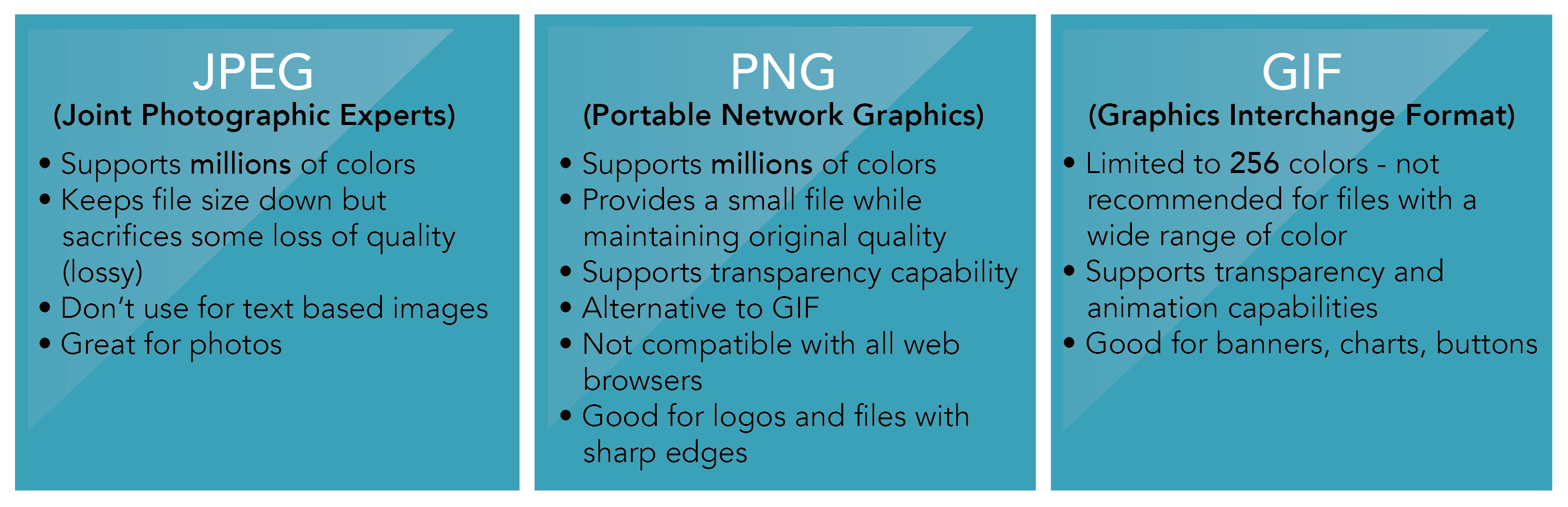
1.) JPG, PNG, or GIF? As the three most popular file formats for email, many don’t know the differences or advantages of using one file format over the other. Below is a chart that highlights the capabilities as well as what each file format is known for.
 2.) Consider the 70:30 rule. When formatting and strategizing the placement of items within your email, it’s important that 70 percent of the aspect ratio is text, while 30 percent is images. Spammers tend to send messages with little wording because spam filters are analyzing their text; therefore, the detection of an image heavy email can land your message in your audience’s spam folder.
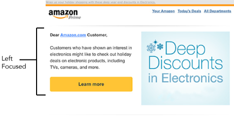
3.) Design for the left side of an email. According to Nieslen Norman Group, web users spend 69% of their time viewing the left half of the page. With that in mind, if your email is split into columns, place important content, images, or call-to-actions on the left. If your email doesn’t have columns, be sure to left justify your content.
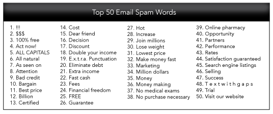
 4.) Be aware of spam triggering words. Spam filters are built into many different email networks and your word choice can have a large impact on whether or not the email is ever seen by the viewer. If you ever have to use a spam word, avoid using it more than once or try substituting the word with something similar. Below is a list of the top 50 spam words.
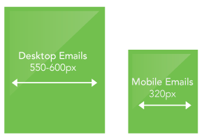
 5.) Design with the appropriate pixel width in mind. Nothing is worse than an email that makes you scroll side-to-side in order to see all of its information. In terms of desktop viewing, it’s best to design at about 550-600 px. However, when it comes to mobile, the width should be around 320 px.
 6.) Include CTA buttons and place them strategically. It’s important to place your call-to-action near the top of your email as readers tend to skim that region before deciding if proceeding is worth their time. Keep mobile in mind and create buttons that are large enough to click via touchscreen on a mobile device.
7.) Lastly, link items appropriately and provide a web version option. In order to prevent your page from loading slow, don’t place items (such as videos) directly within your email. Instead, provide a link or place a still shot from the video that takes your viewer directly to your website. Also be sure to provide a link to the online web version of your email to avoid altered formatting or missing images that result from email being displayed differently on different email programs. 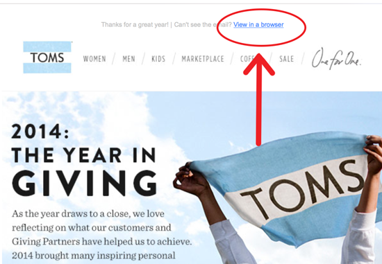
Pingback: Email Marketing Design Tips | Right On Interactive | The Marketing Technology Alert
Pingback: The Top 13 MarTech Articles Curated Friday, 1/23/15 | The Marketing Technology Alert
Pingback: 7 Email Marketing Design Tips | Right On Intera...
Pingback: The Benefits of Using Past Data to Plan Out Future Marketing Campaigns | Right On Interactive