“Design is creativity with strategy.” – Rob Curedale
It’s not surprising that beauty is a top priority in web design, relying on visual attraction or a “coolness factor” to determine success and retain page visitors for extended periods of time. However, visual sharpness is only half the battle. Remembering to design with a purpose and strategy, even within areas you may believe require little thought, can increase visitor interaction and boost engagement. Below are five simple web design techniques to consider if you are aiming to improve visitor engagement on your website.
1. Consider heat map findings when determining the placement of key information.
In the Nielsen Norman Group study, heat maps (which use an eye tracking technology) recognized that users read information in an F-shaped pattern across thousands of different websites. Since site visitors do not take the time to read content all the way through, it’s vital to place the most important information in the top two paragraphs. Material proceeding that section should start with information-carrying words as users will scan down the left side of the page and read the first few bits of text.
![]()
2. Implement accent colors and call-to-action buttons strategically.
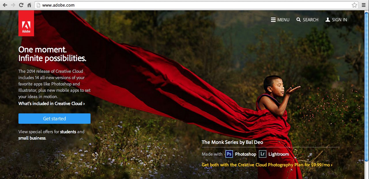
Effective call-to-action buttons (CTAs) have the ability to trigger a customer to signup, join, buy now, share, download, view, etc. Together, CTAs and accent colors have the ability to draw attention, increasing engagement and sparking action. It’s all about, size, placement and color. Take into consideration the graphic below. Red and shades of green are the primary colors of Adobe’s landing page, while the bright blue “Get Started” button contrasts and draws attention. It’s the only visible blue button and is strategically placed in an area that closely follows the F-shaped layout discussed in the heat map study. Directional cues are also present as the robe of the boy blows in the direction of the CTA button (this was no accident), guiding the eye to the area of action.
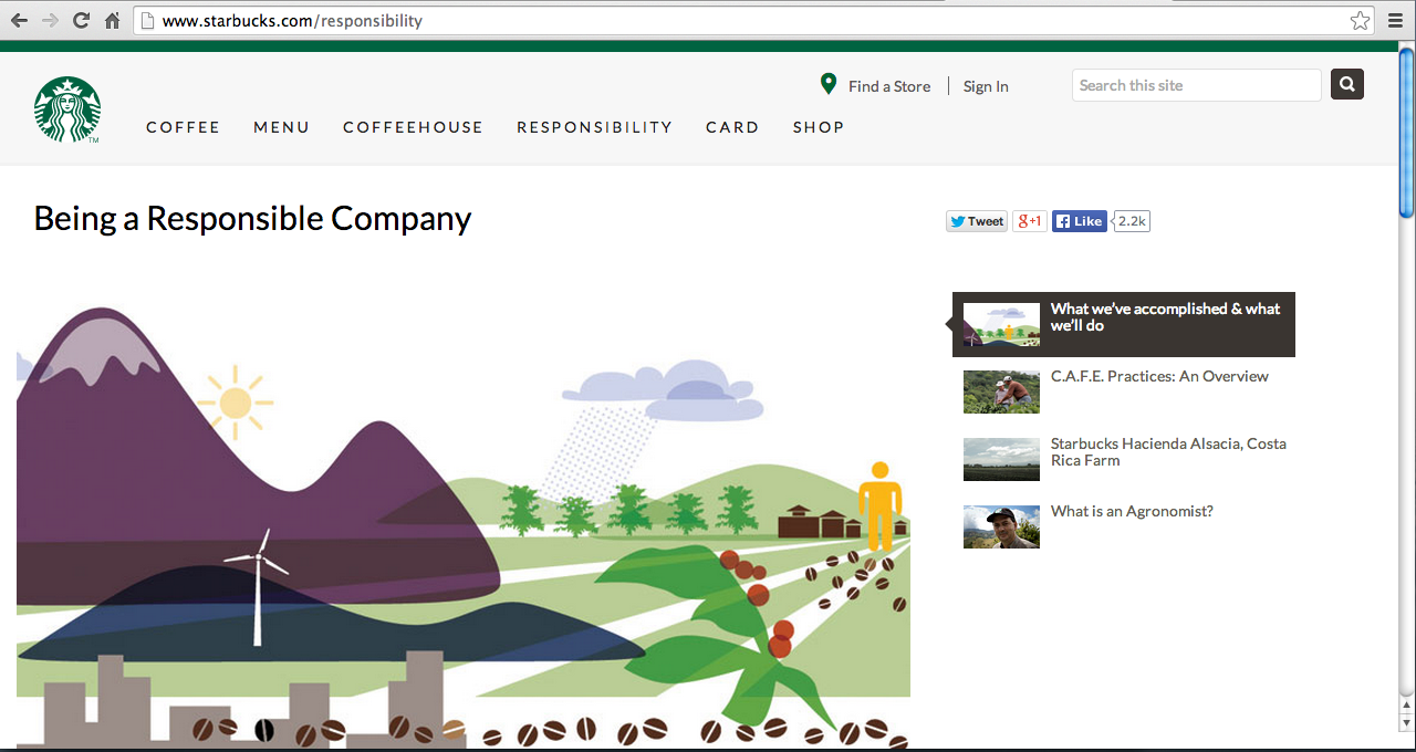
3. Are all your pages designed to be as strong as your landing page?
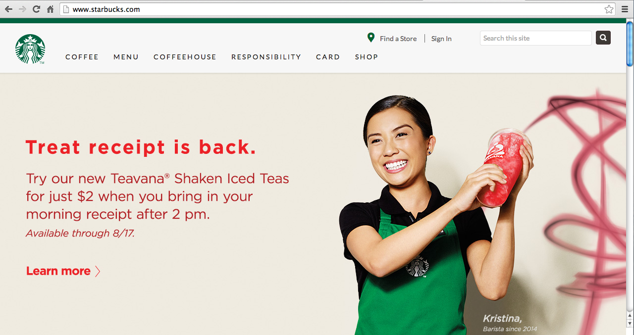
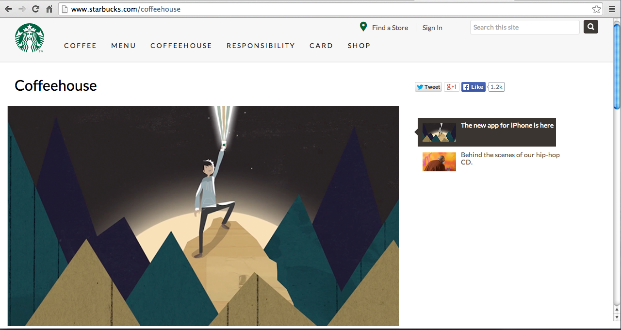
As Motiliti put it, “The goal of a landing page is to persuade a website visitor to take an action.” He says, “If this simple definition is true then every page on the internet is a landing page.” Website visitors don’t always begin their journey on your homepage therefore, it’s important to remain consistent and provide key pieces of information near the top of all pages. Starbucks does a good job of keeping its main navigation pages consistent. As you click through its various tabs, you never run into an area with annoying blocks of text to sift through and decode. It’s organized and the visuals and videos follow a coherent layout that guides you through site information.
4. Are your pages too busy?
Remember less is more—respect whitespace and avoid clutter. Too many things on one page of a website can make the navigation experience frustrating. Paolo Vidali, senior digital marketing strategist at Dragonsearch, shared, “When things are hard to find you lose visitors.” He added, “To retain visitors for longer periods of time, make sure pages do not have competing calls to action or visual clutter (e.g., lots of graphics, photographs or animated gifs) that would draw the visitor’s eyes away from the most important part of the page.”
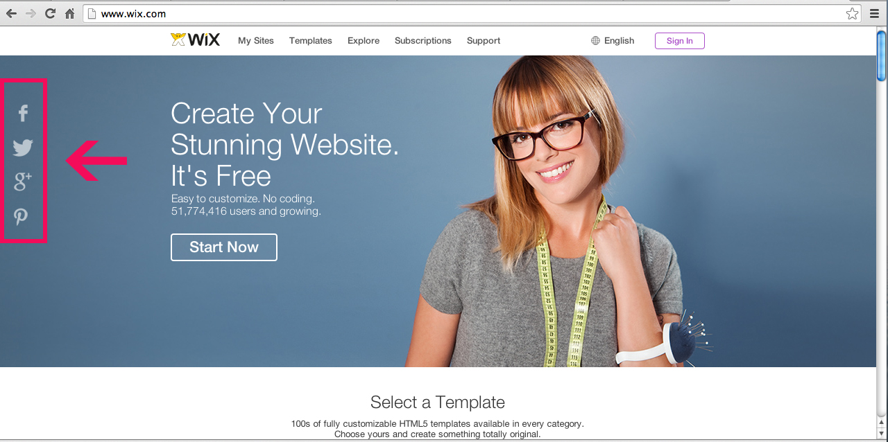
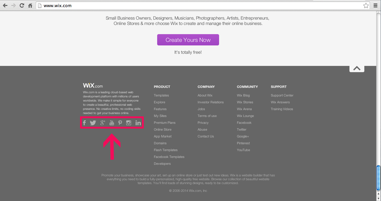
5. Do you make it easy for your audience to socialize with you?
To increase interaction and engagement, let your visitors know what social media websites you’re on. Place social media handles on all webpages and allow people the ability to share and comment on your information. Jessie Jenkins, Social Media and Content Specialist at Thrive Internet Marketing says, “A good rule of thumb is that the more visible your social buttons are, the more users will interact with them.” She added, “’Follow’ icons should be included within the header/footer of your website, preferably every page, as your social media profiles are an important source of information to users and an easy way to stay connected.”
What are some other web design techniques you have used to improve site visitor engagement? Did they work? How are you measuring your website engagement?